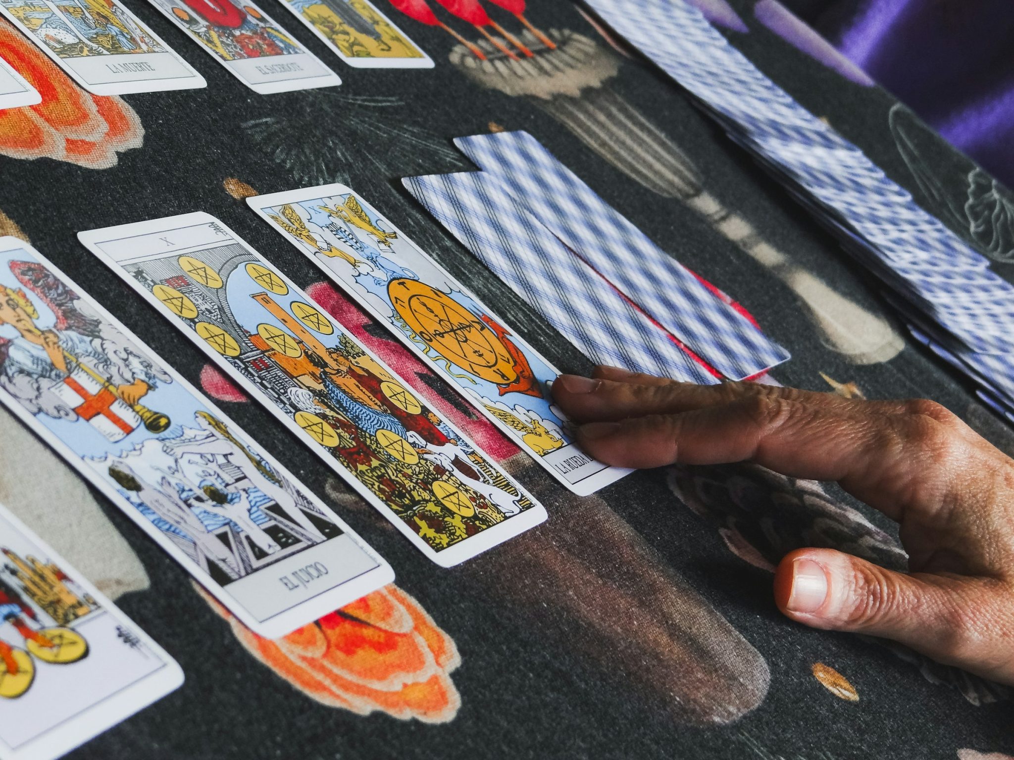
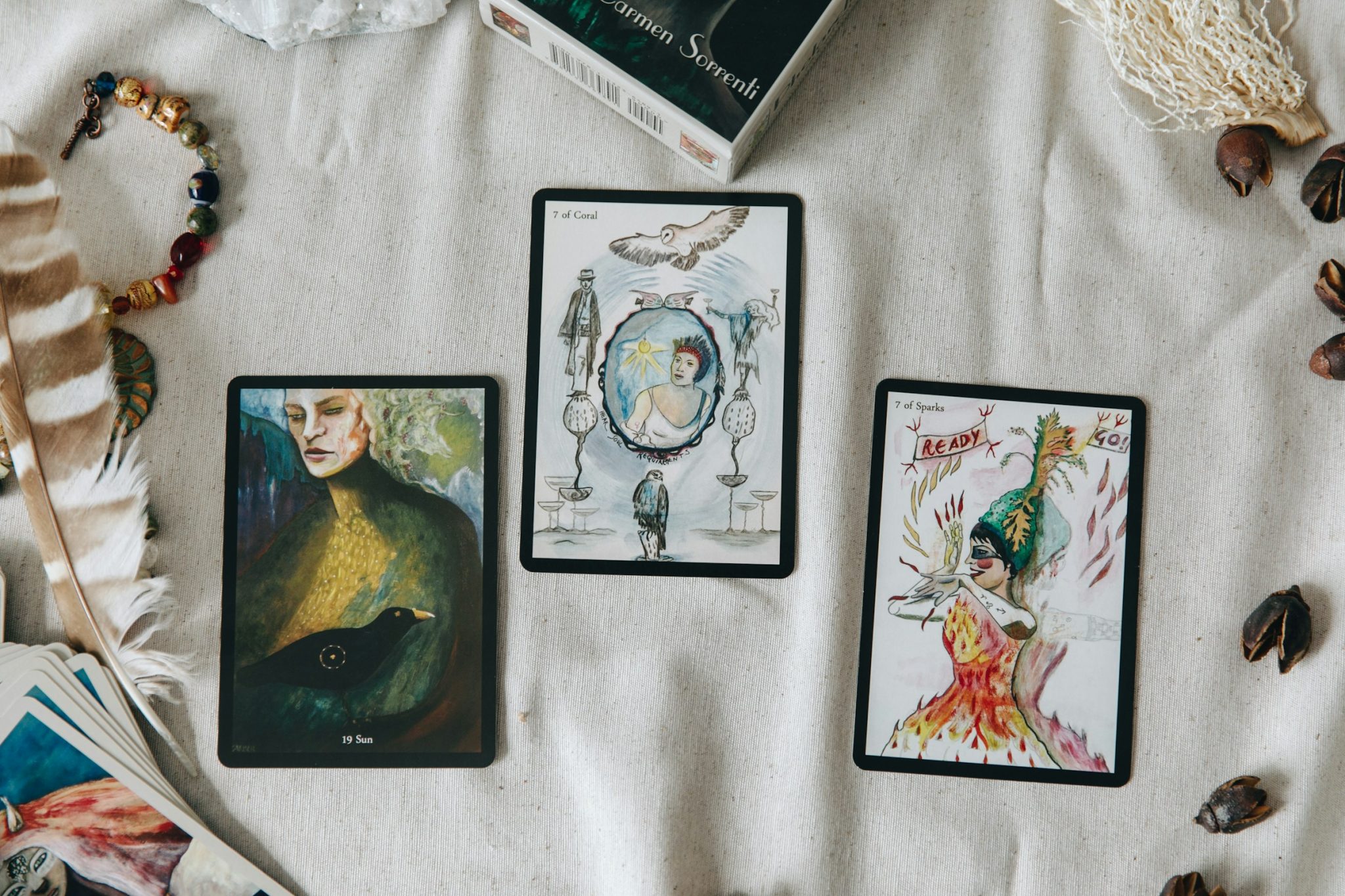
Designing a tarot deck often starts with visuals. Colors, symbols, composition, style. But many creators hit the same problem halfway through the deck: the cards look nice, yet they don’t read clearly. The issue is rarely artistic skill. It’s usually a missing step between tarot meanings and visual decisions.

A tarot meanings list isn’t just for reading cards. Used correctly, it becomes a design framework—one that keeps your artwork focused, readable, and consistent across the entire deck. This guide walks through how to translate meanings into visuals, step by step.
Start With Meaning, Not Aesthetics
Before choosing colors or symbols, you need to decide what each card is actually saying.
Reduce Each Card to One Core Message
Most tarot cards come with long lists of keywords. That’s useful for interpretation, but dangerous for design. For artwork, every card needs one core message—a single sentence that captures its essence.
Not:
- freedom, innocence, risk, leap of faith, curiosity
But:
- Potential without commitment
When the message is clear, visual choices become simpler. When it’s not, the artwork starts pulling in multiple directions.
Separate Meaning From Context
A card may appear in love readings, career spreads, or personal growth questions—but the core meaning stays the same. Design for the meaning, not the context. If you try to visually represent every possible scenario, the card becomes cluttered and vague. A strong tarot image stays abstract enough to work everywhere, yet specific enough to be felt immediately.
Turn Words Into Design Variables
Once the meaning is clear, the next step is translating it into visual language.
Choose Symbols With One Job
Every symbol on a tarot card should earn its place. Ask one question: If this symbol appeared on its own, would it still point to the same idea?
If the answer is no, it’s decoration—not communication.
Strong tarot symbols are simple, repeatable, and consistent. They don’t explain everything, but they anchor the meaning so the reader has something to hold on to.
Use Composition to Show Tension and Direction
Composition does as much storytelling as symbols.
- Centered vs. off-center
- Balanced vs. tilted
- Rising vs. falling
- Enclosed vs. open
These choices silently communicate power, movement, conflict, and stability. Often, composition carries the message before the viewer consciously notices any details.
Use Color and Texture to Set Emotional Tone
Color is not about preference—it’s about emotional speed. Some cards should hit fast and sharp. Others should feel heavy, muted, or slow. Texture, contrast, and line quality reinforce that feeling.
If the emotional tone of the artwork contradicts the meaning, the card becomes confusing, no matter how accurate the symbols are.
Use a Meanings List as a Design Tool
Before drawing, it helps to standardize how you interpret meanings across the deck. At this stage, many creators rely on a structured tarot card meanings list to break each card down into usable components, such as:
- one core message
- a small set of visual keywords
- an emotional tone
- an implied action or state
Organizing meanings this way ensures that every card is designed using the same logic. Instead of improvising 78 times, you’re applying a repeatable system—one that keeps the deck cohesive and intentional.
This step is often invisible in the final product, but it’s what separates a unified deck from a collection of unrelated illustrations.
Keep the Deck Cohesive With Simple Rules
A tarot deck works best when it feels like a single world.
Build a Visual Rule Sheet
Instead of reinventing the language for every card, establish a few rules early on.
For example:
- conflict is shown through opposing shapes or sharp intersections
- stability uses symmetry and grounded forms
- change relies on curves, flow, or layered depth
These rules don’t limit creativity—they focus it.
Repeat Motifs Across Suits and Numbers
Consistency builds intuition. When similar meanings have visual patterns, readers learn faster. This also helps them trust the deck more. Repeating motifs in suits and number progressions make the deck feel purposeful. You’re not just copying designs; you’re strengthening its structure.
Design for Upright and Reversed Meanings Without Extra Artwork

You don’t need two versions of every card to support reversed readings.
Create Intentional Ambiguity
Good tarot imagery allows multiple readings without collapsing into chaos. Symbols can be flexible rather than absolute. The same image can suggest flow or blockage depending on orientation and context.
Use Focus and Visual Weight to Shift the Message
Direction, gaze, and balance matter. When reversed, the viewer’s eye lands differently. What felt dominant may become secondary. What looked active may feel restrained. This subtle shift is often more effective than overt visual changes.
To make this work consistently across the whole deck, treat reversals as a design requirement, not an afterthought. If you’re turning your artwork into a printed custom deck, you can use a custom tarot card service like EzraCard—then plan your visual hierarchy (main subject vs. secondary elements) so the message still reads clearly even after rotation.
Validate Your Artwork Against Meaning
Before finalizing a card, test it.
The One-Sentence Test
Display the artwork without the title or explanation. If someone can capture the main idea in one sentence and it aligns with your intent, then the design is successful.
The Stranger Test
Ask someone who doesn’t know tarot what they feel from the image. Focus on the emotions or situations it brings up, not its meaning. If their feelings don’t match the intended tone, change the visuals instead of the explanation.
Conclusion
Strong tarot card artwork isn’t complex. It’s about alignment. When meaning, emotion, and visuals match, the card becomes clear, memorable, and easy to understand. A tarot meanings list doesn’t restrict creativity—it gives it a spine.


